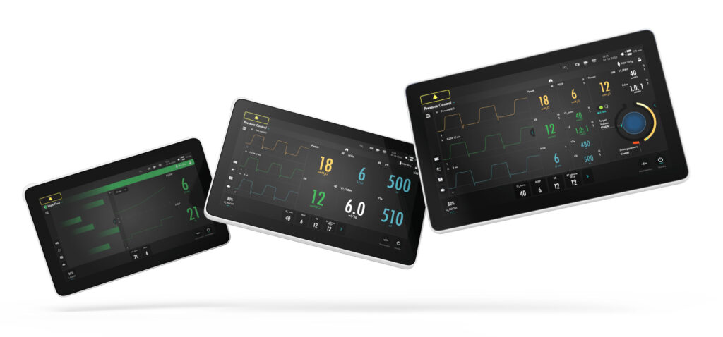
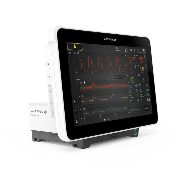
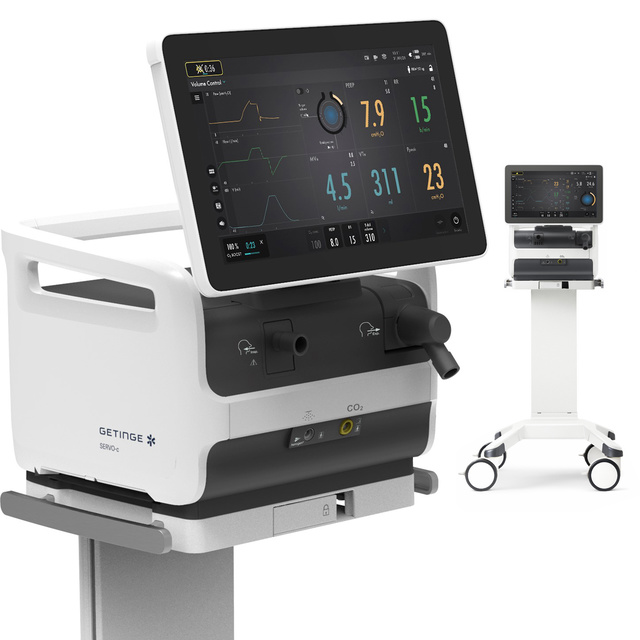
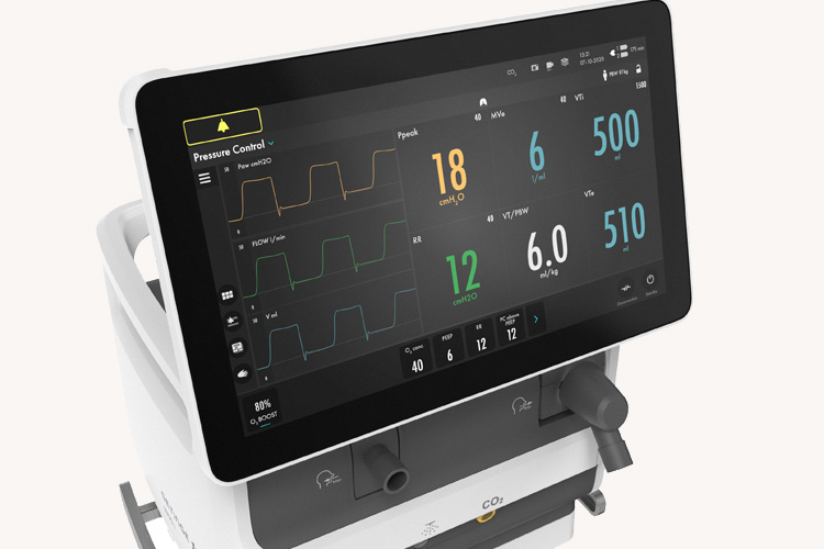
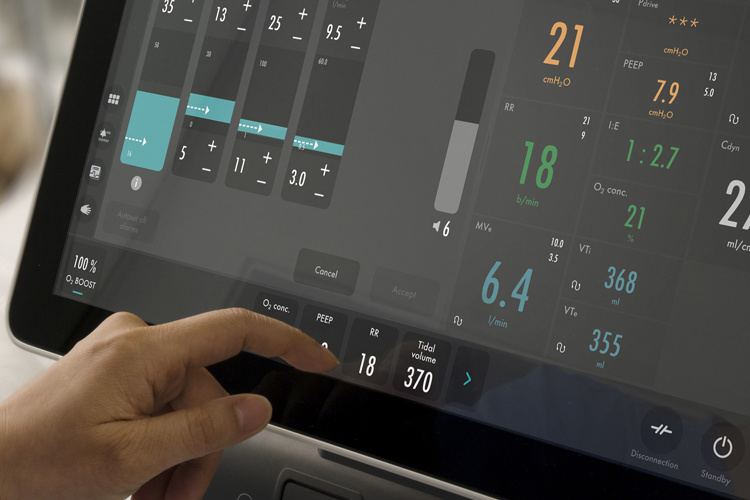
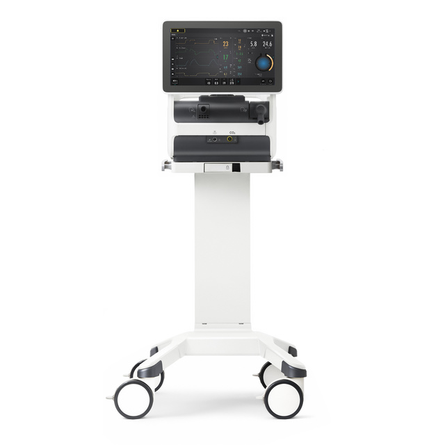
It took us quite some time but now it is out, Getinge’s GUIDE system gets prestigious design award in the categories User Interface & Product Interfaces
GUIDE is a design system for medical devices. The hardware and software have been designed together to create a complete toolbox that includes physical panels and a comprehensive design system with guidelines and coded components. The system was created for acute care environments where clinicians are working with an increasing number of advanced devices with very different interfaces.
GUIDE is an effort to make Getinges products not only look but also feel and behave the same way. That way is calm, clear and requires minimum attention so that clinicians can focus more on patients and less on devices.
My contribution to this is the visual design, interaction design and implementation via design thinking over serveral products and sites.
The response to GUIDE has been fantastic from our users.
Eating healthy and varied meals has become expensive, and hunting for local grocery discounts takes both time and energy.
That is exactly why we created Plentish.
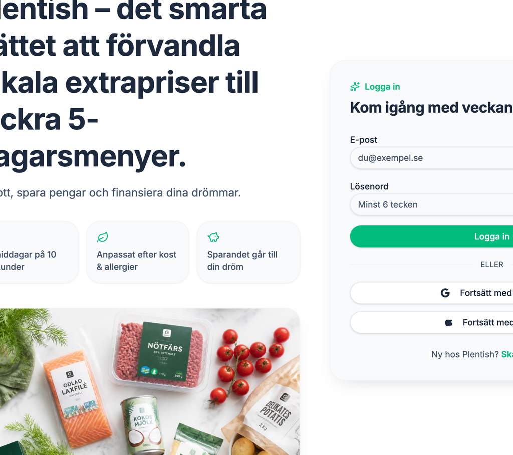
Plentish is a smart web tool that flips meal planning on its head. Instead of forcing you into rigid meal kits, our platform lets your local supermarket’s best weekly deals dictate your dinner menu.
How It Works
With a single click right here on our website, Plentish does all the heavy lifting for you:
Scrapes Local Deals: The platform scans your nearby supermarkets for the best discounts of the week.
Composes a 5-Day Menu: Our AI matches the cheapest ingredients with our recipe database to create a tailored 5-day dinner plan.
Personalized For You: Filter your recipes based on high protein needs, vegetarian diets, or common allergies like gluten and lactose.
Tracks Health Metrics: Every meal displays a clear breakdown of calories and macronutrients.
Smart Shopping List: Get an organized shopping list where pantry staples are separated so you can quickly cross off what you already have at home.
Feed Your Dreams
What makes Plentish truly unique is our digital piggy bank. We believe that saving money should be rewarding.
Inside your account, you simply set up a personal dream goal—like a vacation, a new gadget, or a night out. Every time you generate a menu, Plentish calculates exactly how much money you saved compared to regular prices. These savings are instantly funneled into your visual dream tracker, showing you how your smart grocery choices take you one step closer to your goals.
Become a Beta Tester
We have just launched our very first version of Plentish using the platform Lovable, and we want to refine it together with you. We are currently looking for budget-conscious food lovers to test our website entirely for free and give us feedback.
Ready to shave thousands off your grocery budget and start feeding your dreams? Sign up for our beta waitlist below, and we will send your access link straight to your inbox.
Forma is the design system behind Brilliant’s employee-experience platform — the shared components, tokens and patterns that turn survey data and people-analytics into interfaces people actually trust.
As Design Lead, I owned the system end to end: visual foundations, component vocabulary, and the documentation that lets product and engineering build confidently without asking permission first.
Overview
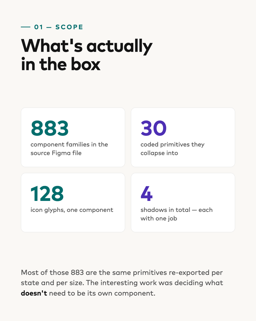
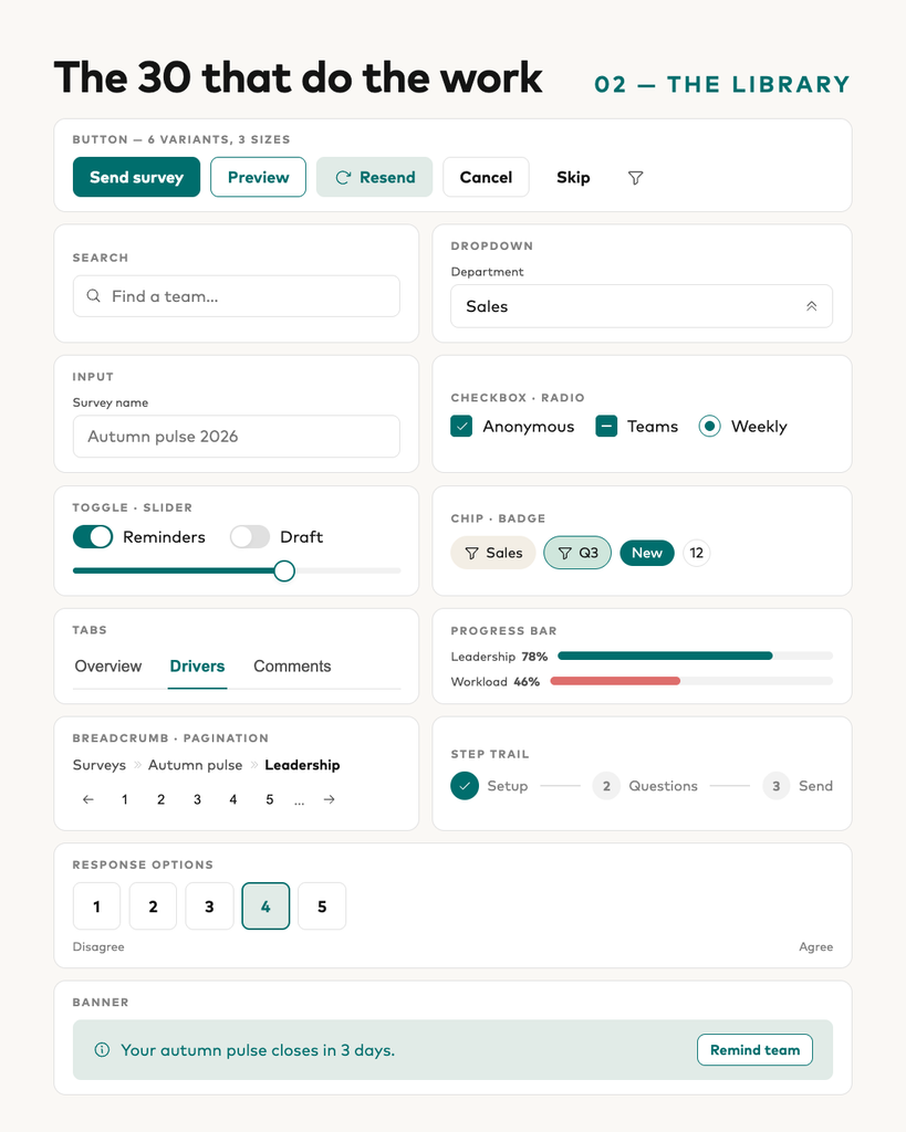
The source file holds 883 component families. The coded system holds 30.
That gap is the whole project. Most of those 883 were the same primitives re-exported once per state, per size, per icon weight. The work wasn’t building more — it was deciding what didn’t need to exist.
The foundations
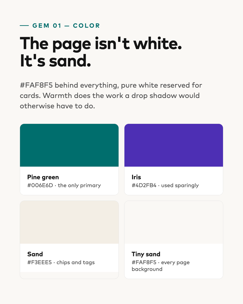
Pine green is the only primary. Iris is a secondary accent, used sparingly. Everything else is greyscale.
The page background is sand, not white. Pure white is reserved for cards, so a card reads as lifted without a single shadow. Warmth does the work an elevation would otherwise have to do.
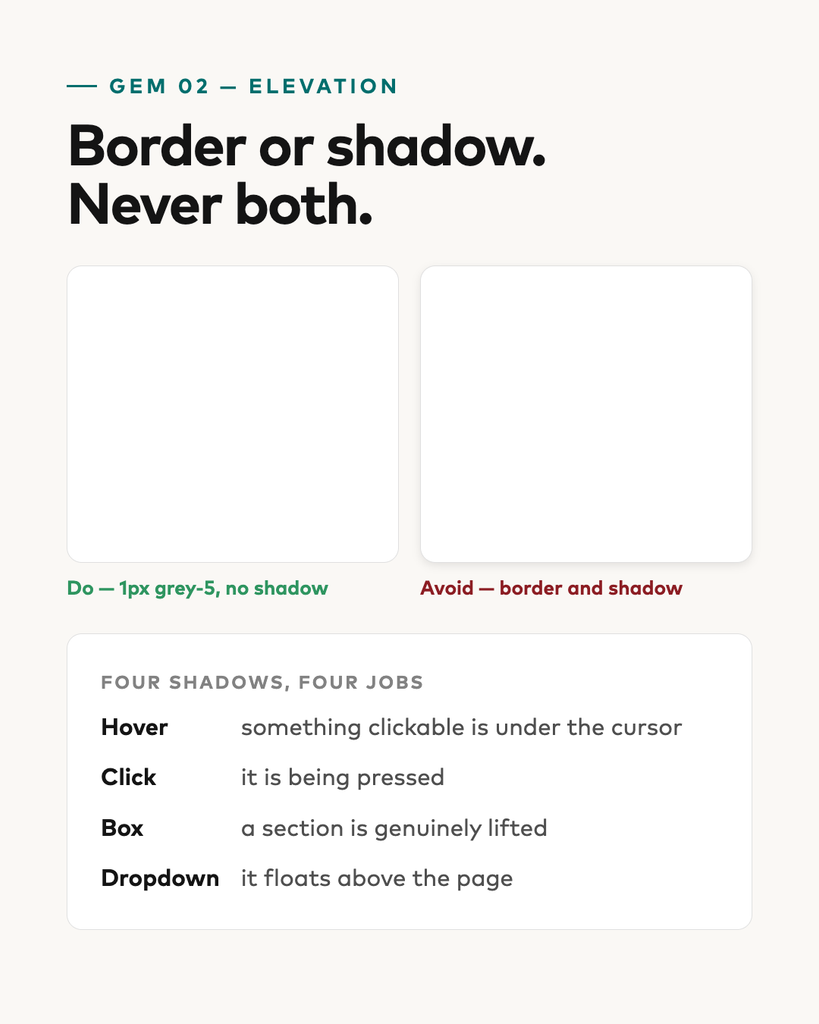
Border or shadow. Never both. Cards get a 1px grey-5 border and no shadow. Four shadows exist in the whole system, each with exactly one job: hover, click, box, dropdown.
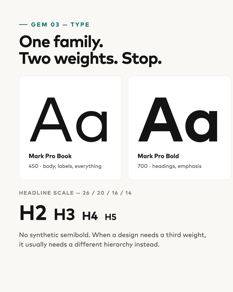
One family, two weights. Mark Pro Book and Bold. No synthetic semibold — when a design seems to need a third weight, it usually needs a different hierarchy.
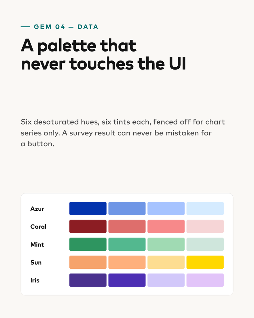
A data-viz palette fenced off from the UI. Six desaturated hues, six tints each, for chart series only. A survey result can never be mistaken for a button.
The library
Thirty components carry the product: buttons, inputs, selection controls, chips and badges, progress bars, tabs, breadcrumbs, pagination, step trails, response scales, banners, cards, modals, sidebar and topbar.
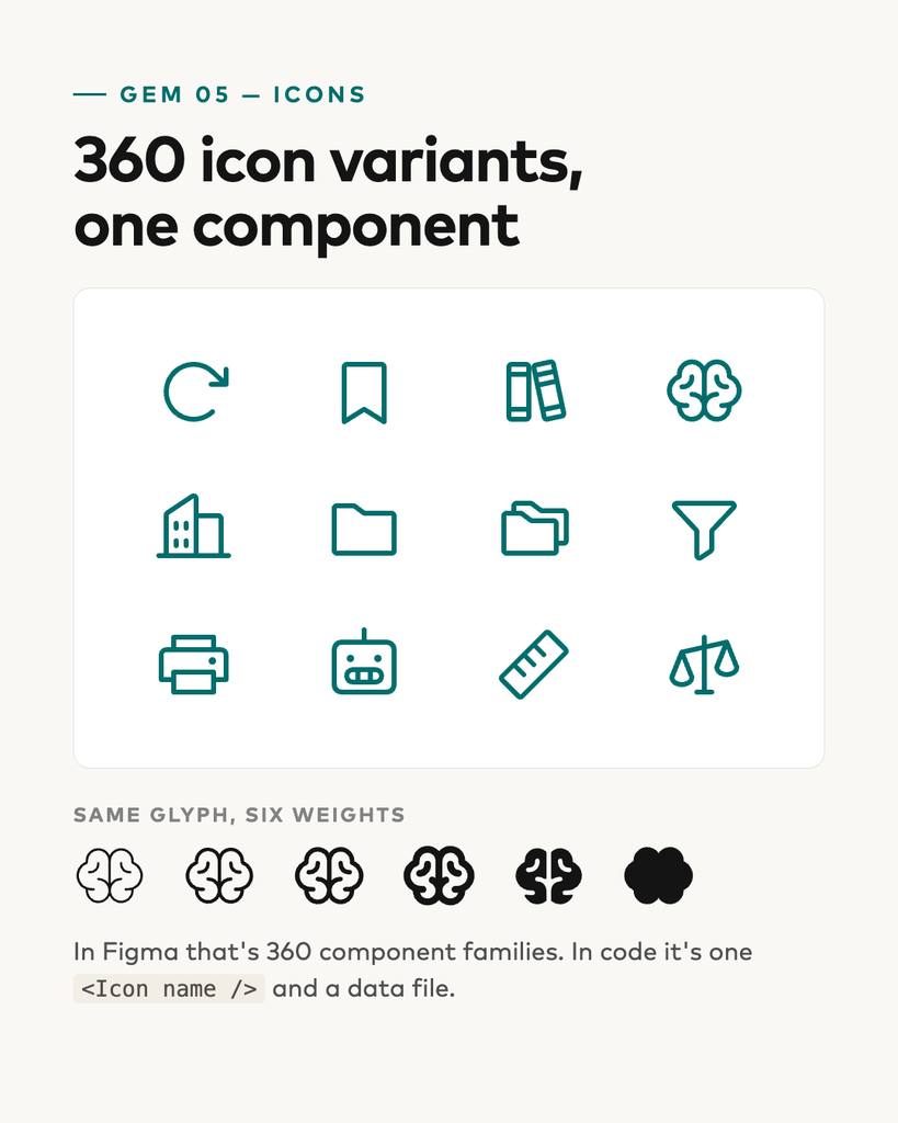
The icon set was the clearest win. Around 150 glyphs × 12 format/weight variants is 360 component families in Figma.
The part that isn’t components
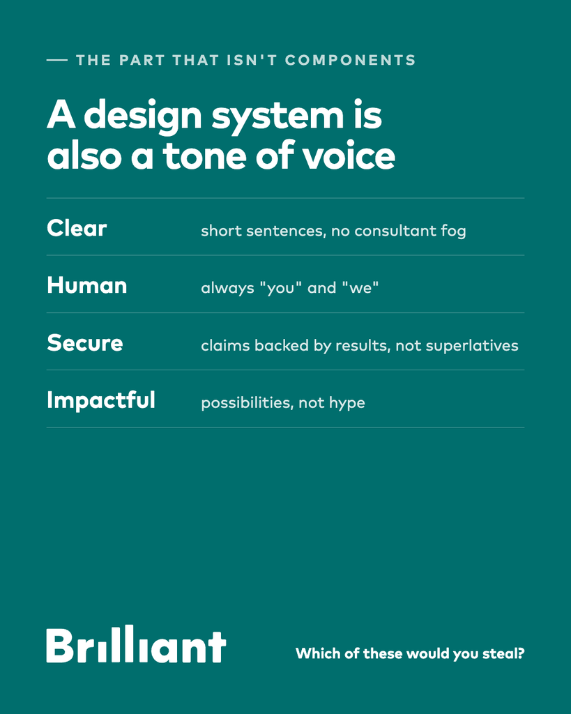
A design system is also a tone of voice. Brilliant’s is clear (short sentences, no consultant fog), human (always ”you” and ”we”), secure (claims backed by results, not superlatives) and impactful (possibilities, not hype).
That turned out to be the hardest part to keep consistent — and the part that makes the components feel like one product rather than thirty.
A bit of a nerdy word, perhaps, but surprisingly fun and useful. Over the summer, I’ve spent some time building two small sites.
One is dedicated to my highly subjective restaurant experiences, while the other is my attempt at creating a digital wine cellar, directly connected to Systembolaget.se.
Nothing groundbreaking, but I’ve had a lot of fun putting them together. Feel free to take a look at the results.
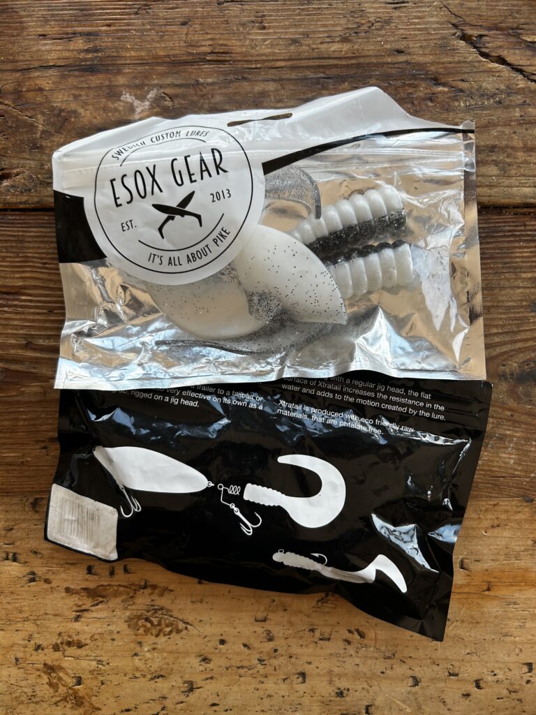
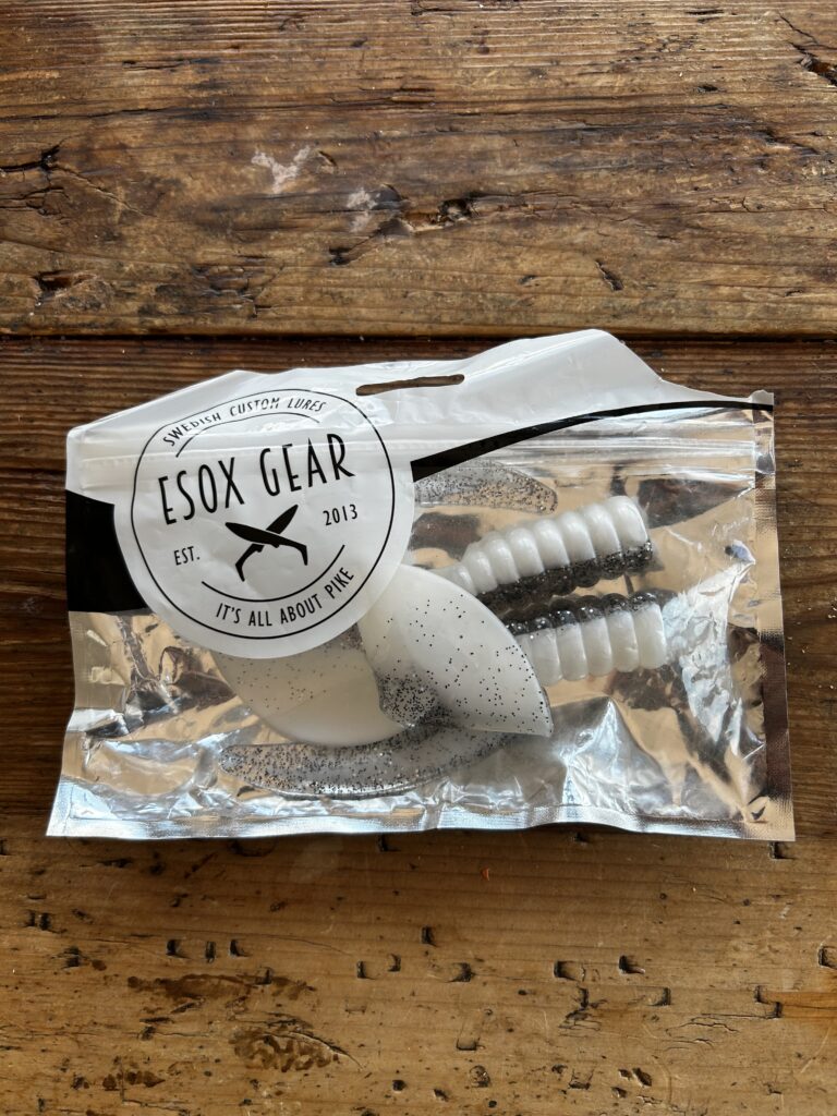
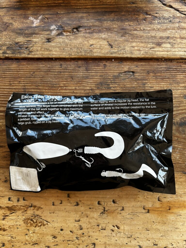
Esox Gear Packaging A bold, functional design that combines a clean black-and-white palette with a strong circular logo of crossed lures. Transparent windows showcase the product, while lure silhouettes reinforce brand identity. The result is packaging that feels authentic, practical, and instantly recognizable to anglers.
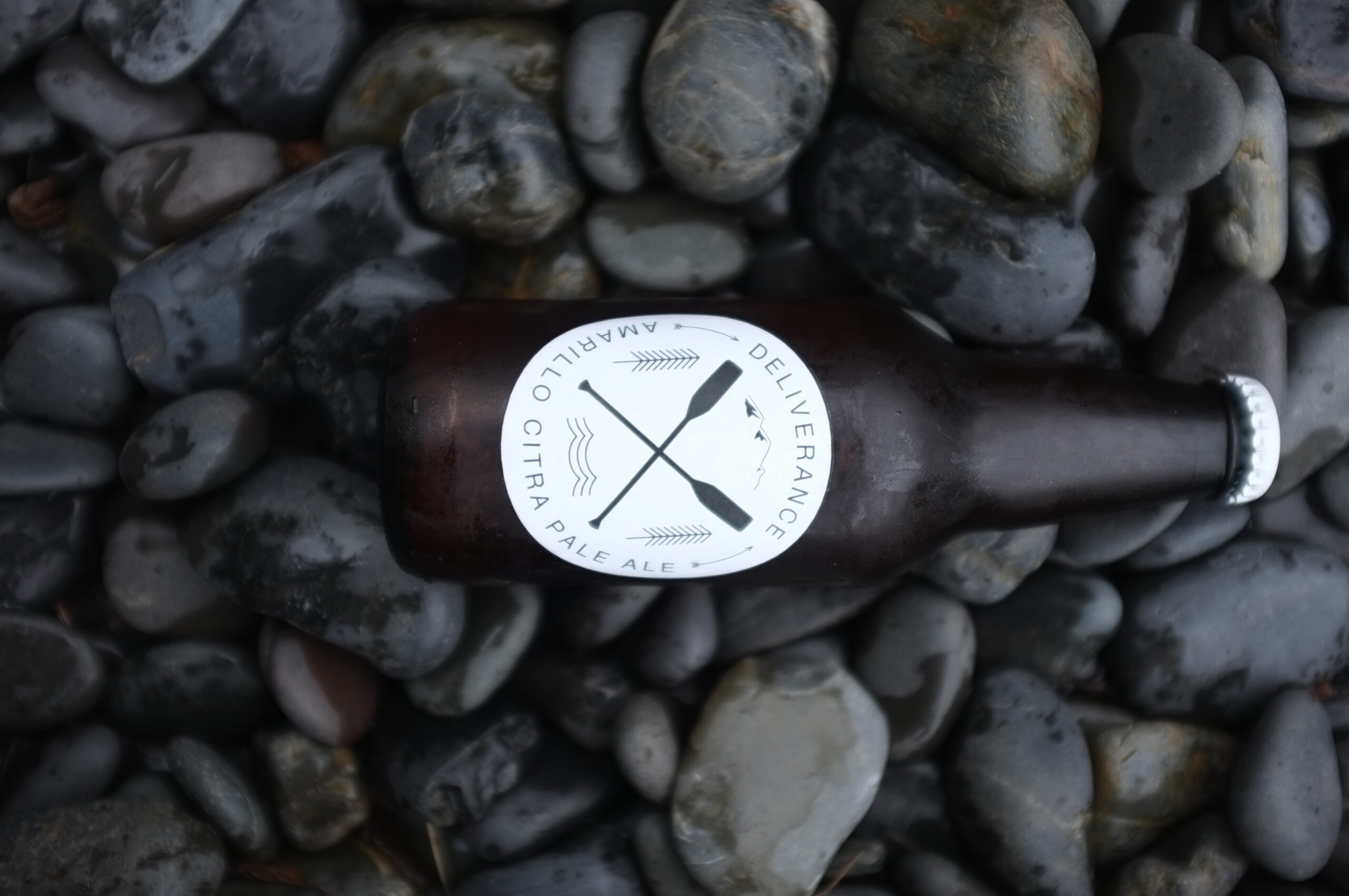
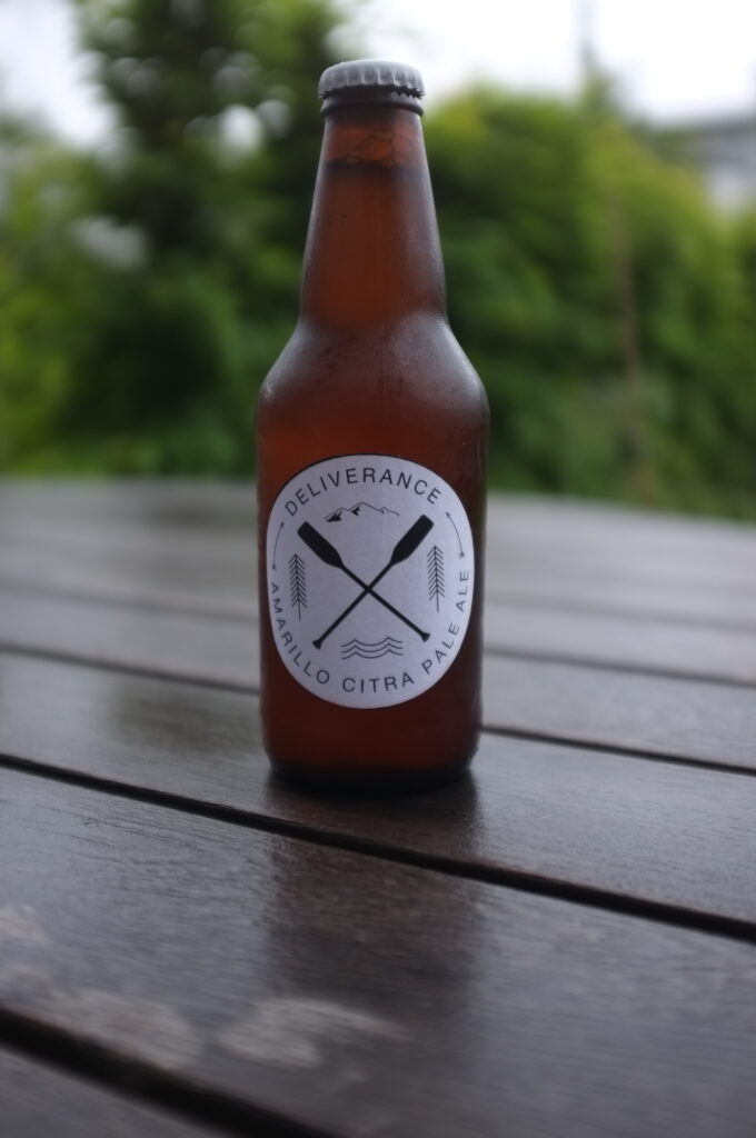
Deliverance – Amarillo Citra Pale Ale A bright, refreshing pale ale brewed with Amarillo and Citra hops. Expect bold citrus and tropical fruit aromas, balanced with a crisp bitterness that keeps you coming back for more.
Crafted for explorers, wanderers, and those who crave the wild – Deliverance is your perfect companion whether you’re riverside, trailside, or simply unwinding after the journey.
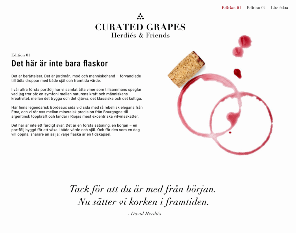
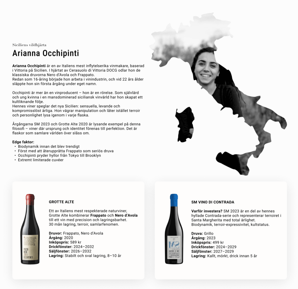
Curated Grapes is more than an online wine store—it’s a journey into the stories, people, and places behind each bottle. Designed to feel like an editorial magazine, the platform combines visual storytelling with a premium shopping experience, turning wine discovery into something personal and inspiring.
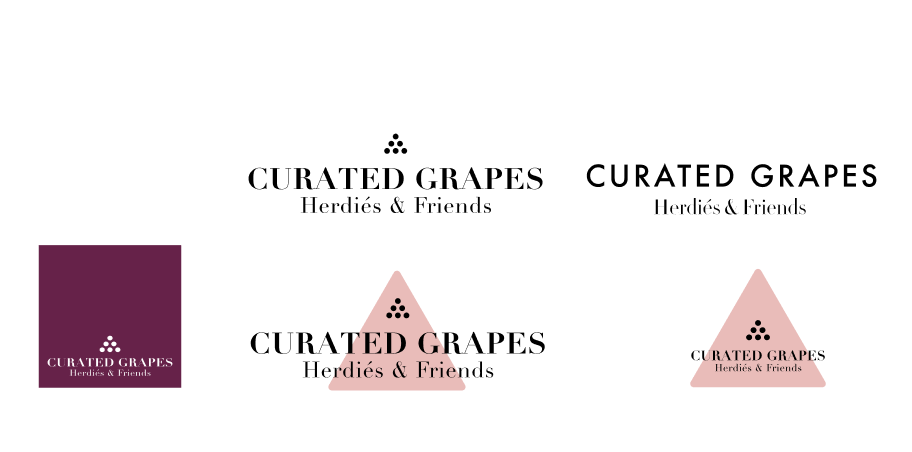
Logo explorations
Challenge
Most wine e-commerce platforms focus on price and variety but lack emotional engagement and context around the product. Wine lovers want more than a transaction—they want to connect with the story behind the bottle. The challenge was to design an interface that combines visual storytelling, product transparency, and usability in a seamless way.
Goals
Create an editorial-style layout that feels premium and immersive.
Highlight the winemakers’ personalities and philosophies through storytelling and imagery.
Simplify product discovery and shopping experience without sacrificing design aesthetics.
Build a sense of curation and trust that differentiates the brand from generic e-commerce sites.
Process
Research & Insights
Analyzed high-end e-commerce platforms and editorial websites for inspiration.
Identified key emotional drivers for wine buyers: heritage, authenticity, and exclusivity.
Concept Development
Defined visual identity: soft pastels, bold accents, and minimal typography to convey sophistication.
Planned modular sections for storytelling, winemaker profiles, and product showcases.
Design Execution
Hero section with tagline and curated message to set the tone.
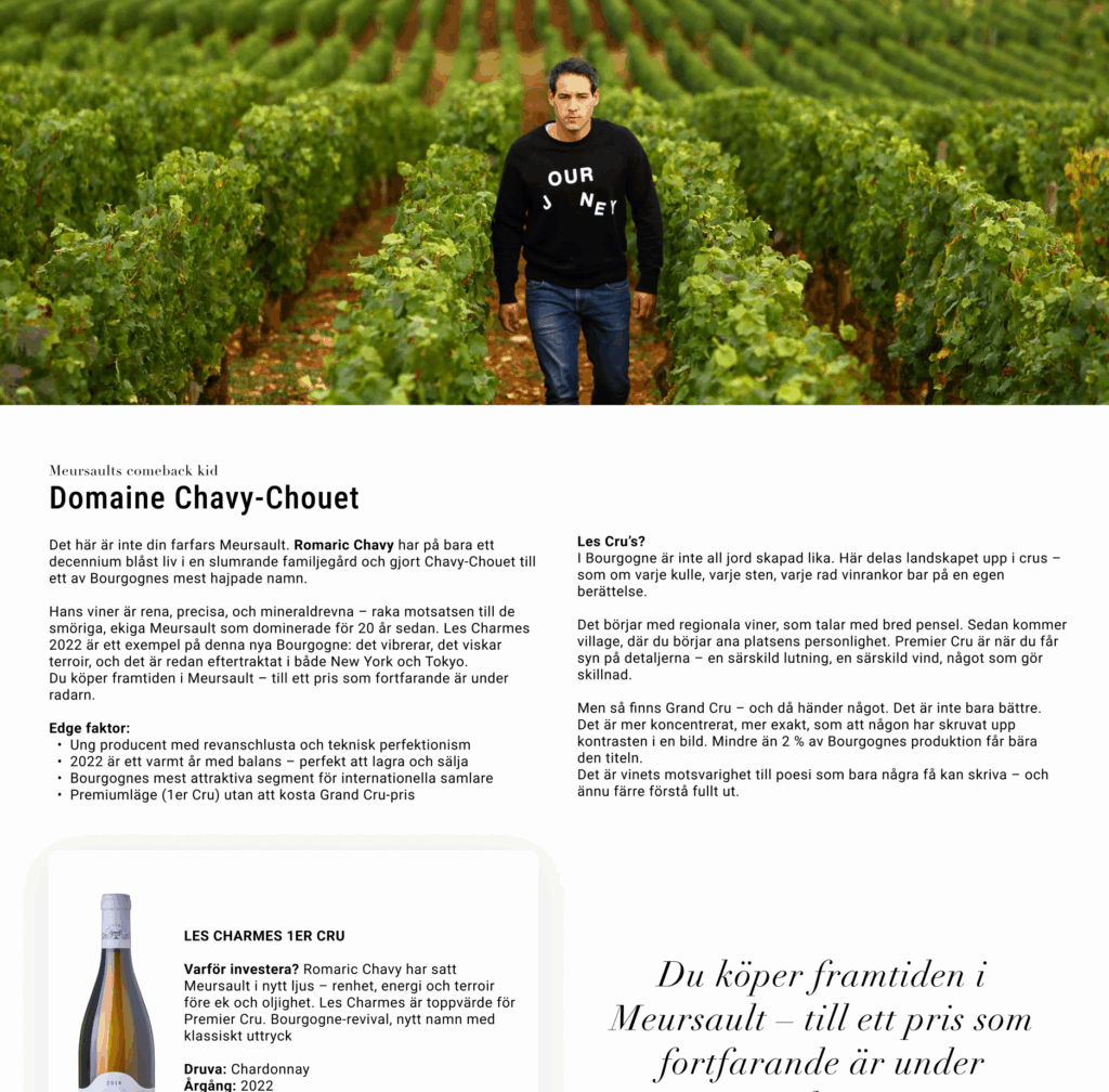
Winemaker stories with portraits, geographic maps, and quotes for authenticity.
Product cards with clear hierarchy: image → name → key details → CTA.
Integrated editorial elements like pull quotes and fact boxes to break up content and enhance readability.
Solution
The final design delivers a premium, immersive experience where users feel like they’re browsing a curated wine magazine.
Whitespace and clean grid structure create an elegant, easy-to-navigate layout.
Storytelling approach elevates the brand and builds trust.
Actionable design ensures product information remains clear and shopping frictionless.
Outcome(Concept Phase)
Successfully translated the brand’s vision into a design system for a future platform.
Received positive feedback on visual hierarchy, storytelling depth, and brand differentiation.
Next step: create e-com and prototyping for user testing and e-commerce integration.
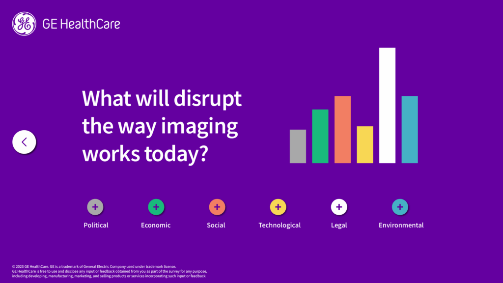
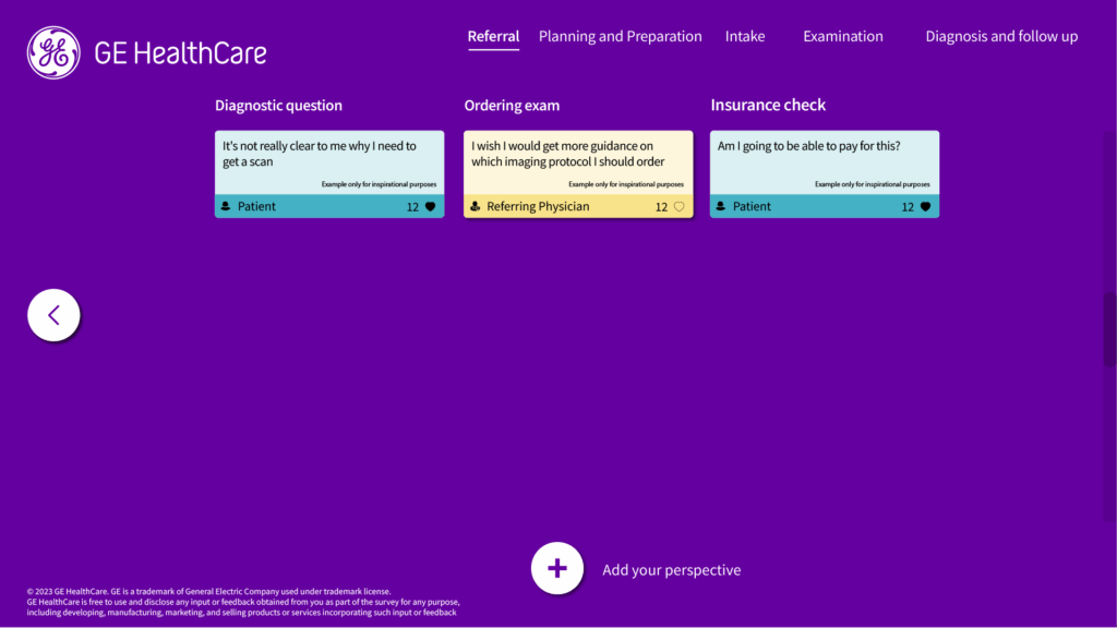
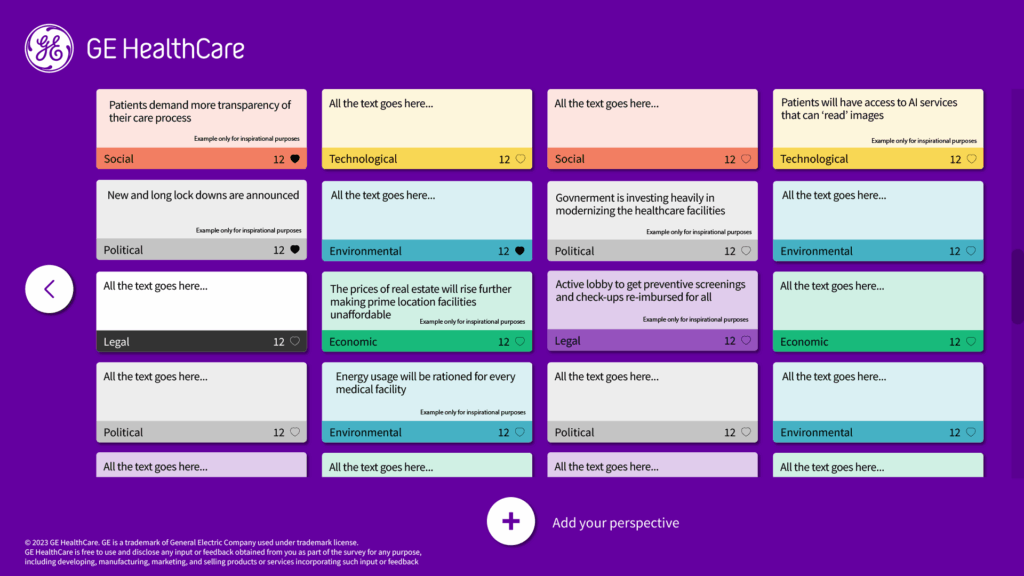
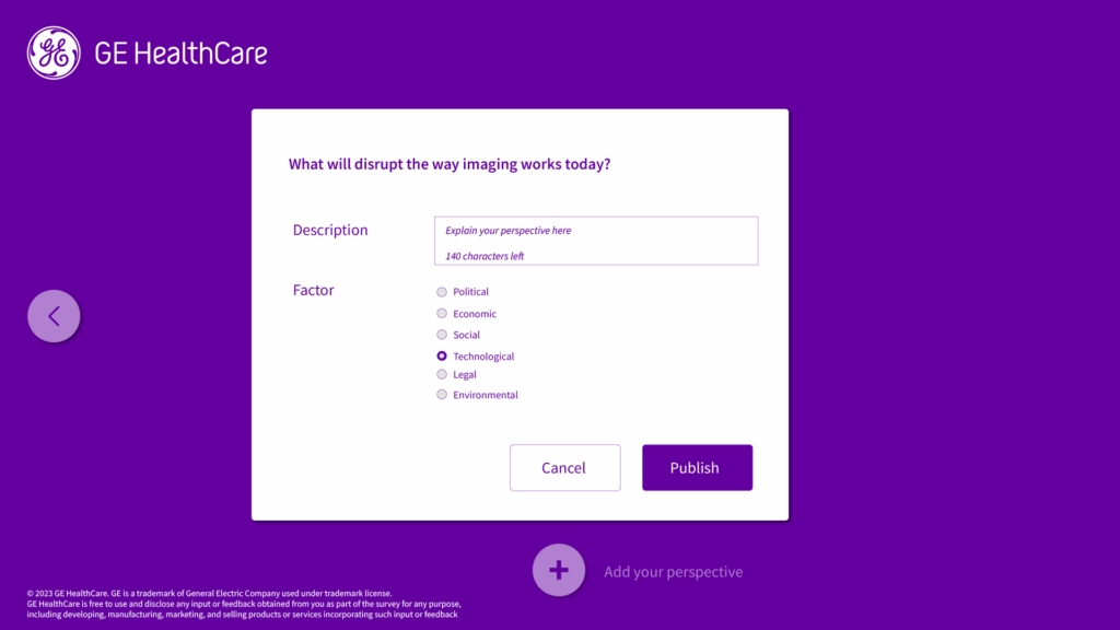
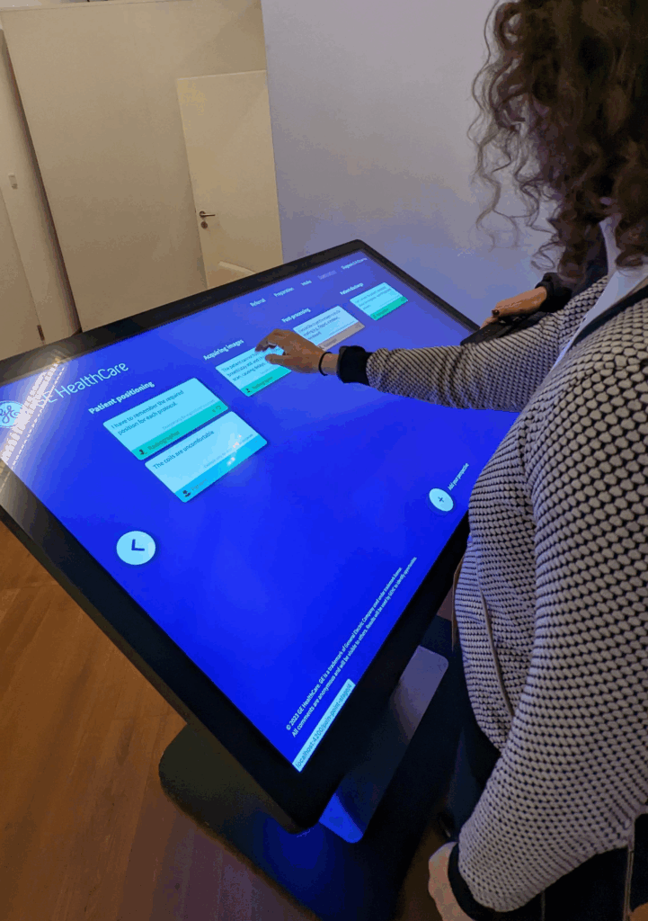
At the European Congress of Radiology 2023, I had the opportunity to design and launch an interactive insights table tailored for radiologists.
The goal? To create a space where radiologists could easily share insights, pain points, and ideas—in real time.
What made it stand out:
User-friendly interface
Clean, modern design
Interactive experience that encouraged engagement
Valuable feedback from professionals across Europe
The response was overwhelmingly positive—many appreciated how intuitive and visually appealing it was. It sparked meaningful conversations and surfaced real challenges radiologists face daily.
Thrilled to share my first fully remote collaboration with the incredibly talented team in Germany!
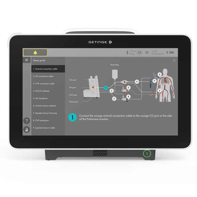
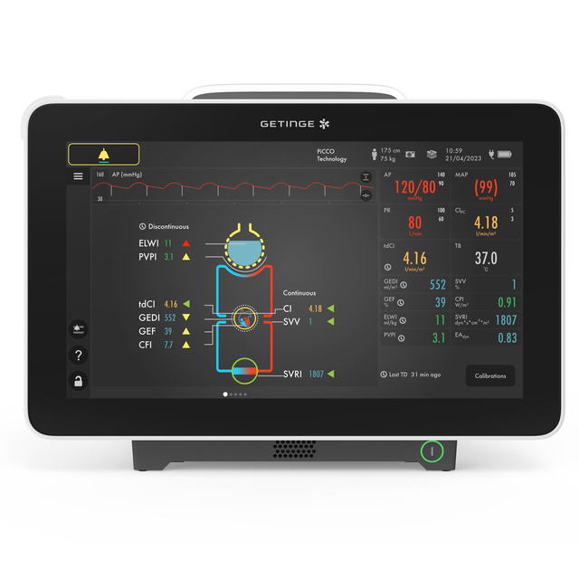
I had the opportunity to contribute both visual design and interaction design for Pulsiocare — a cutting-edge solution that empowers clinicians from the OR to the ICU.
Pulsiocare provides a comprehensive view of a patient’s hemodynamic status, enabling real-time, data-driven decisions when they matter most.
Grateful for the experience and proud of what we’ve achieved together!
Proud to share the first product designed using our award-winning design system, GUIDE. Collaborating with a multidisciplinary team, I contributed to both the visual and interaction design, ensuring a seamless and engaging user experience.