Forma is the design system behind Brilliant’s employee-experience platform — the shared components, tokens and patterns that turn survey data and people-analytics into interfaces people actually trust.
As Design Lead, I owned the system end to end: visual foundations, component vocabulary, and the documentation that lets product and engineering build confidently without asking permission first.
Overview
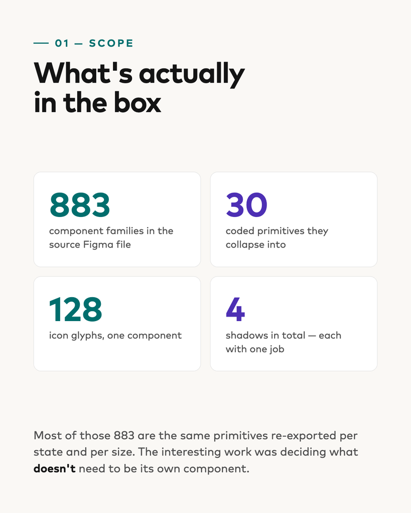
The source file holds 883 component families. The coded system holds 30.
That gap is the whole project. Most of those 883 were the same primitives re-exported once per state, per size, per icon weight. The work wasn’t building more — it was deciding what didn’t need to exist.
The foundations
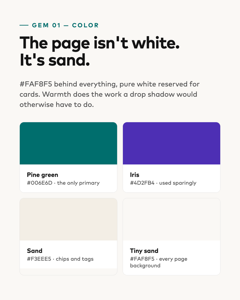
Pine green is the only primary. Iris is a secondary accent, used sparingly. Everything else is greyscale.
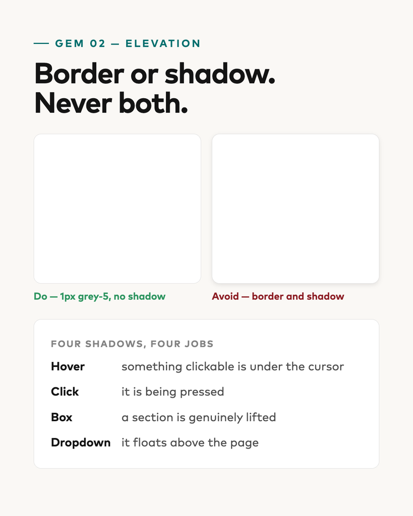
The page background is sand, not white. Pure white is reserved for cards, so a card reads as lifted without a single shadow. Warmth does the work an elevation would otherwise have to do.
Border or shadow. Never both. Cards get a 1px grey-5 border and no shadow. Four shadows exist in the whole system, each with exactly one job: hover, click, box, dropdown.
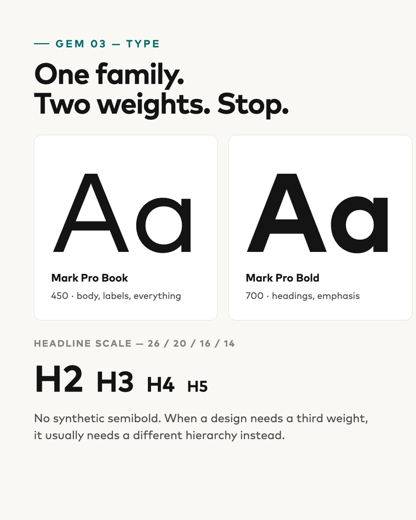
One family, two weights. Mark Pro Book and Bold. No synthetic semibold — when a design seems to need a third weight, it usually needs a different hierarchy.
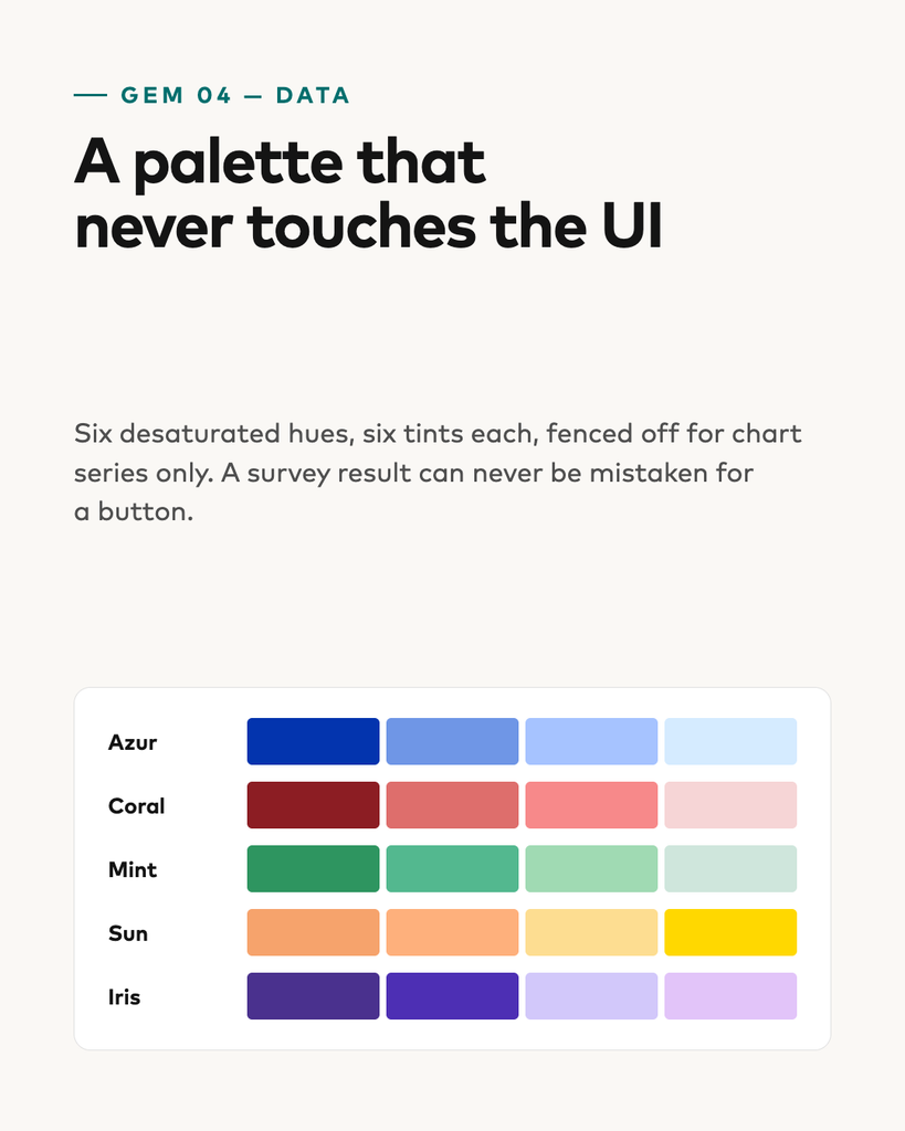
A data-viz palette fenced off from the UI. Six desaturated hues, six tints each, for chart series only. A survey result can never be mistaken for a button.
The library
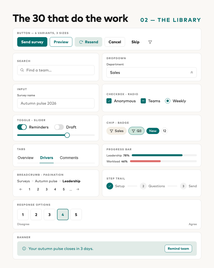
Thirty components carry the product: buttons, inputs, selection controls, chips and badges, progress bars, tabs, breadcrumbs, pagination, step trails, response scales, banners, cards, modals, sidebar and topbar.
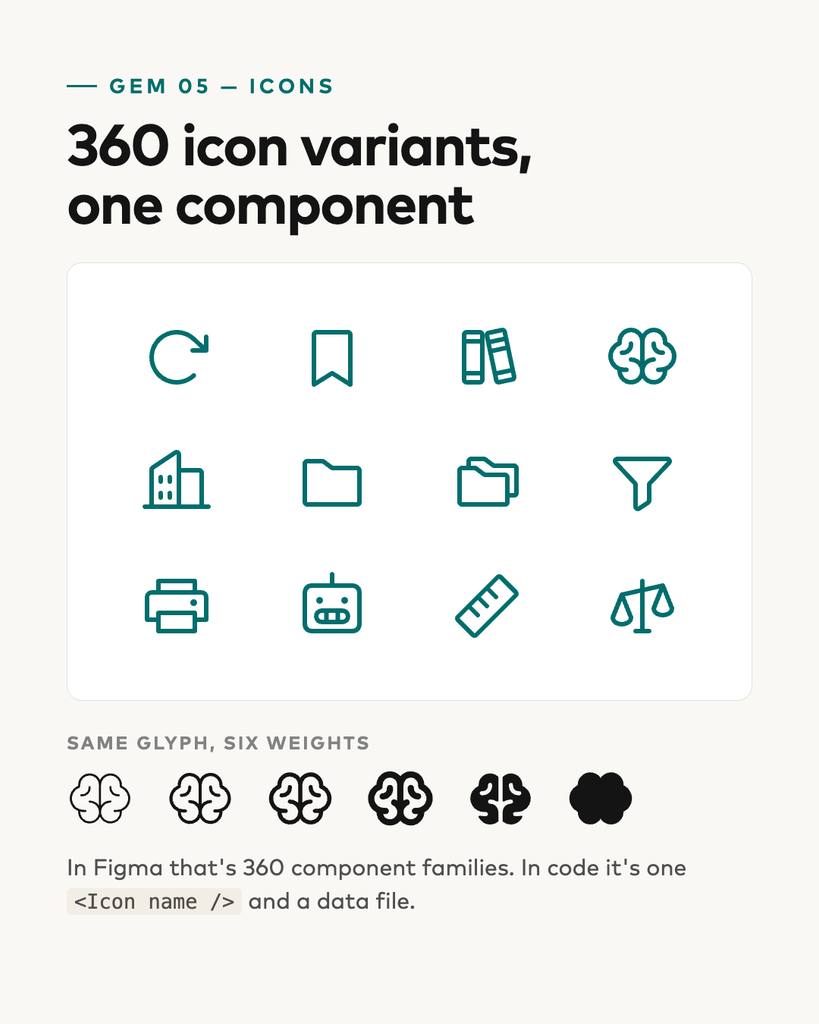
The icon set was the clearest win. Around 150 glyphs × 12 format/weight variants is 360 component families in Figma.
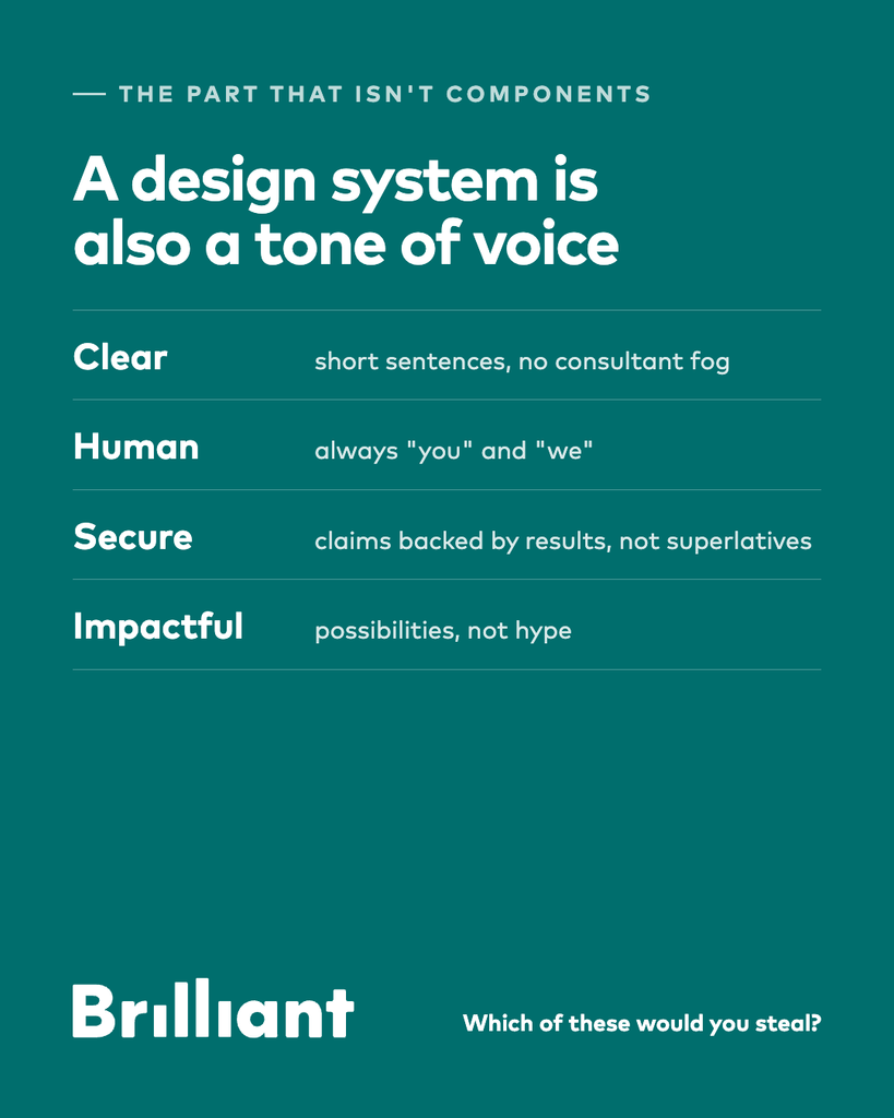
The part that isn’t components
A design system is also a tone of voice. Brilliant’s is clear (short sentences, no consultant fog), human (always ”you” and ”we”), secure (claims backed by results, not superlatives) and impactful (possibilities, not hype).
That turned out to be the hardest part to keep consistent — and the part that makes the components feel like one product rather than thirty.